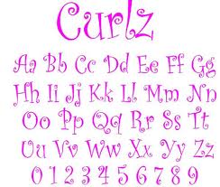
In this video Steve Matteson, typeface designer, speaks about fonts he has developed. He gives some insight into the process of typeface design, and mentions among other fonts he has designed, a font “Curlz”. He notes that while the font successfully met the client’s brief, and is popular and widely used, it has attracted negative reactions from many.
It seems that typeface design is a harsh and judgemental profession, as are other design professions such as architecture, (architects often say, bitterly, that the collective term for architects is a “jealousy of architects”), graphic design and fashion. Designers may be misunderstood by the public (sigh) but those who do understand the work they do – their peers – often dish out the harshest criticism.
I found an example of the strong antipathy towards certain fonts – including Curlz – in a short video about fonts , “How to know the fonts to never use”
The commentator dismisses Curlz (come on – where’s the fun in life) along with several other fonts that seem perfectly fine to the average PUNTER (person using new technology & email regularly). He sledges New Times Roman and Arial as fonts that are outdated, boring and overused. But he does so using outdated, boring and overused sexist humor.
One of his remarks – about Arial – calls to mind the way that some fonts are inextricably linked with particular brands that it is difficult to separate them from each other. He notes that Arial is “So Windows 3.1” …..
Fonts can get stuck with a brand association – think of Ford as in the motorcar brand
Conversely a brand can also get stuck with a font. When Ikea in 2009 changed its brand font from Ikea Sans (customised version of Futura) to Verdana, there was an unprecedented backlash from the public, and the font change was seen by many as the devaluing and degradation of design associated with economic and digital rationalization. The Ikea font debacle, called “Verdanagate” by brand blog, Brand New , is probably the most controversial and publicised brand change case in recent years. It has even been likened to the consumer backlash that occurred when ‘new Coke’ was released in 1985.
It wasn’t just Ikeaphiles who reacted to the change, but ‘typomaniacs’ , graphic designers and designers more generally who feel strongly that the change to verdana represents the homogenization of culture and expression in the digital era.
There are many articles on the ‘Verdanagate’ incident. Perhaps the most interesting is one by Simon Garfield in The Guardian:
“Verdana: Ikea’s flat-pack font
Ikea is changing its font to Verdana – causing outrage among typomaniacs. Should the rest of us care? Absolutely.”
So Verdana has truly become an overdetermined font. In these debates it is emblematic of insidious corporate logic, represents the reduction of complex and diverse forms of work and expression to simplistic, interchangable and uniform units, units that can be easily produced, flat-packed, combined/recombined (like Ikea’s Billy bookcase and friends), distributed, transported, transmitted, stored, duplicated, marketed, consumed and tracked in efficient and profitable ways. It stands for the flattening out of cultural and aesthetic diversity and richness. For the elimination of workers, artisans and designers. In short – the values of microsoft against the values of designers. Its tough being a designer – tougher being verdana.


Leave a comment